Role
Visual design, mood and style boards, research,
user stories, personas, wireframes and sitemaps.
Copperworks Distilling Company is a spirit distillery, tasting room and retail store located at Seattle’s downtown waterfront. They craft small batches of whiskey, gin, cask-finished gin and vodka, using traditional Scottish copper stills, from un-hopped, barley-made beer. Copperworks offers tours, tastings, workshops, event-space rental and a retail and online store. I designed a mock website, with the goal of modernizing their site, making it more engaging, increasing my knowledge of the Sketch app, and exploring my web design process as a whole.
Visual design, mood and style boards, research,
user stories, personas, wireframes and sitemaps.
Sketch, Axure, InDesign, Photoshop
I researched websites of several Seattle-area distilleries, as well as quite a few in Scotland, where there is an abundance of competition. I chose two sites to explore more deeply, analyzing the content, look and feel, site architecture and ease of use. I finished up the research with an on-site tour of Copperworks, to learn more about the process of whiskey distilling. View research (PDF)
Using sticky-notes, I quickly mapped out how users would engage with the website to develop three distinct user stories. I then used the notes to create three personas to guide my design thinking. See the work (PDF)
I created five mood boards to explore different directions for the look and feel of the site, while keeping true to Copperworks’ values. After narrowing it down to Mood Board #5—which focused on the crafting process, people and place—I created three style boards to further develop the look. The style boards show options for colors, typography, photography and a sampling of various website components to see how the pieces would work together.
The existing website was packed with technical information and the navigation menus were long. Using Axure, I worked to simplify the navigation and make it easier for users to find the information they need most. The user stories and personas created previously were my guide in thinking through this stage of the process. View sitemaps (PDF)
Using Sketch, I created five wireframes to explore various page layouts for the website.
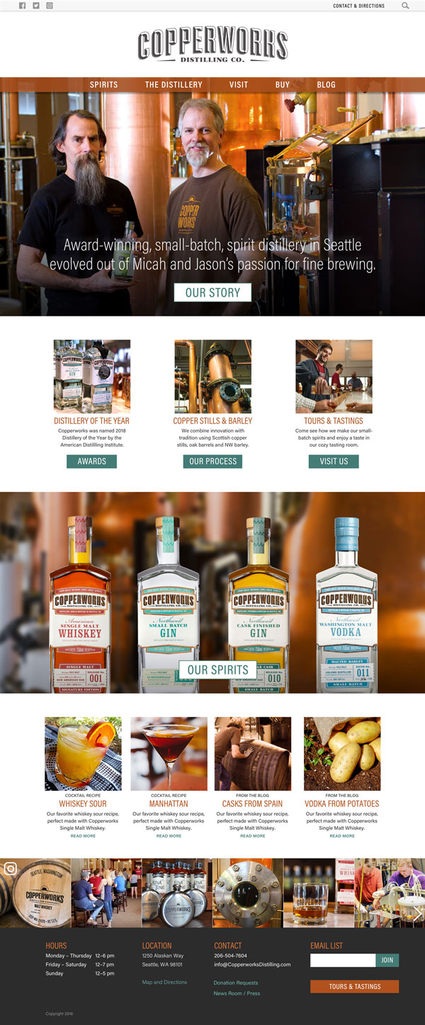
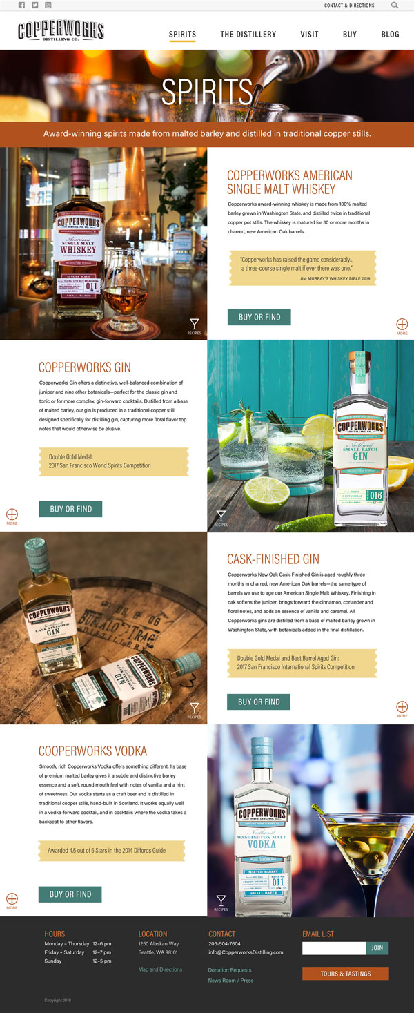
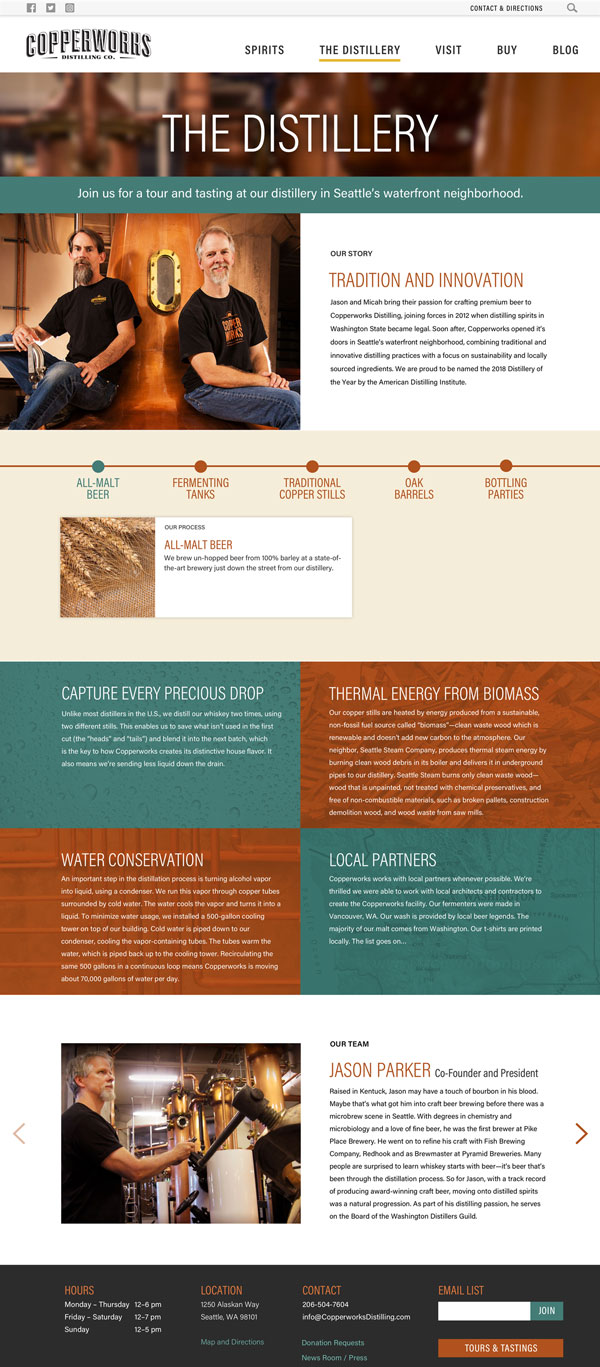
Next, I designed the home, distillery and spirits pages in desktop and mobile views, and became proficient with the Sketch app in the process. The final design is shown below.

Copperworks Home page for desktop screens.

Copperworks Spirits page for desktop.

Copperworks Distillery page for desktop.

Copperworks Home page for mobile screens.

Copperworks Spirits page for mobile.

Copperworks Distillery page for mobile.
 Designer -- Jane Higgins
  Hampstead Academy